
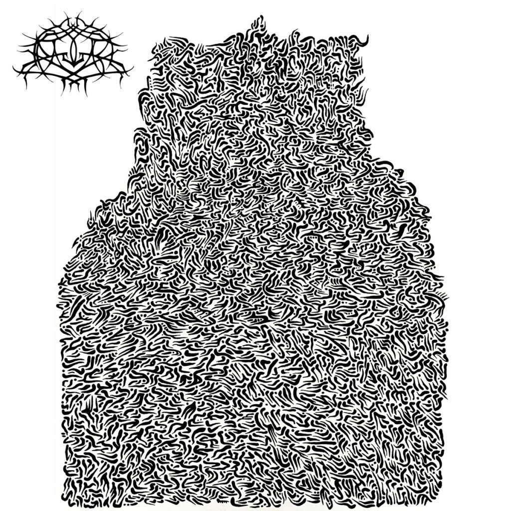
I first heard Krallice in ’09 with Dimensional Bleedthrough. I mainly gave it a listen because of how cool that cover is. The art on this one? I’m not as much of a fan of.
They’ve put out a lot of albums in the last 17 years, and I’ve enjoyed all of it. Good albums, but none of them landed quite like Dimensional Bleedthrough did. I kept coming back to that record and kept waiting for the next one to feel the same.
This one does. The sound feels more like Dimensional Bleedthrough than anything they’ve done since. Maybe they went back to their earlier style, maybe I changed, but something shifted and I like this quite a bit.
Off topic – I heard the whole record in an online listening party, which I didn’t even know was a thing. Wish more people did that.

Leave a comment